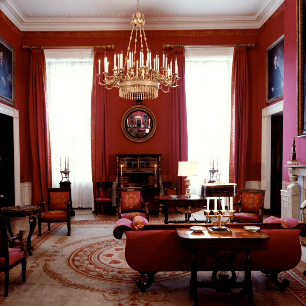
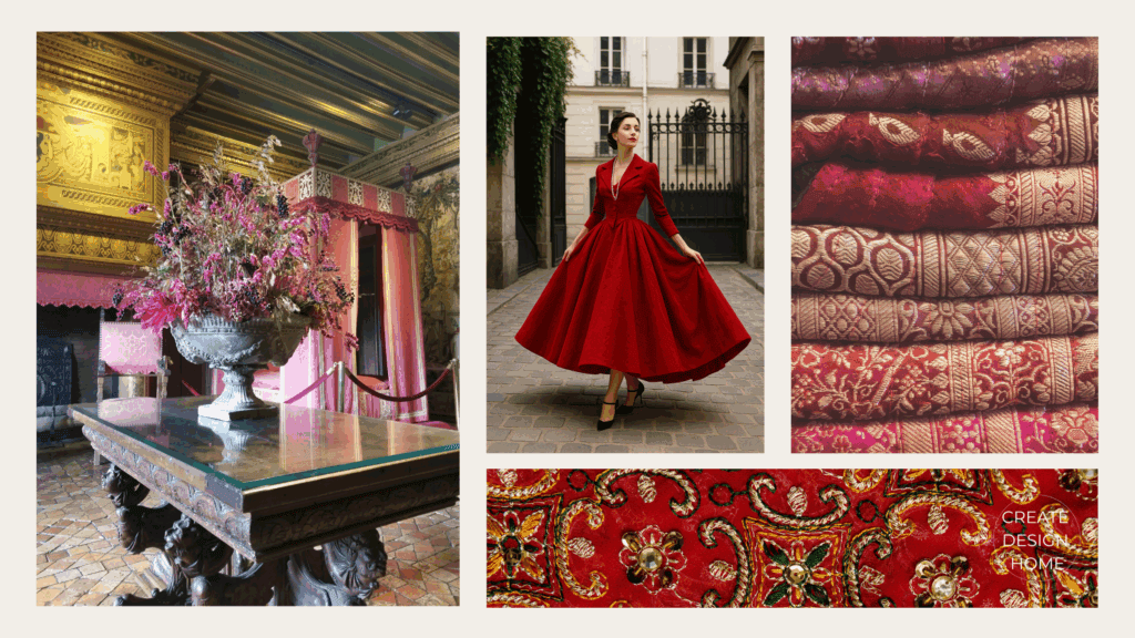
Across centuries, red has been reserved for rooms of importance. In royal and aristocratic interiors, deep reds signaled power, wealth, ceremony, and status. Pigments were costly, dyes were complex to produce, and richly saturated textiles immediately communicated privilege.
Rather than feeling decorative alone, red functioned as atmosphere — enveloping spaces in warmth, drama, and symbolic authority.
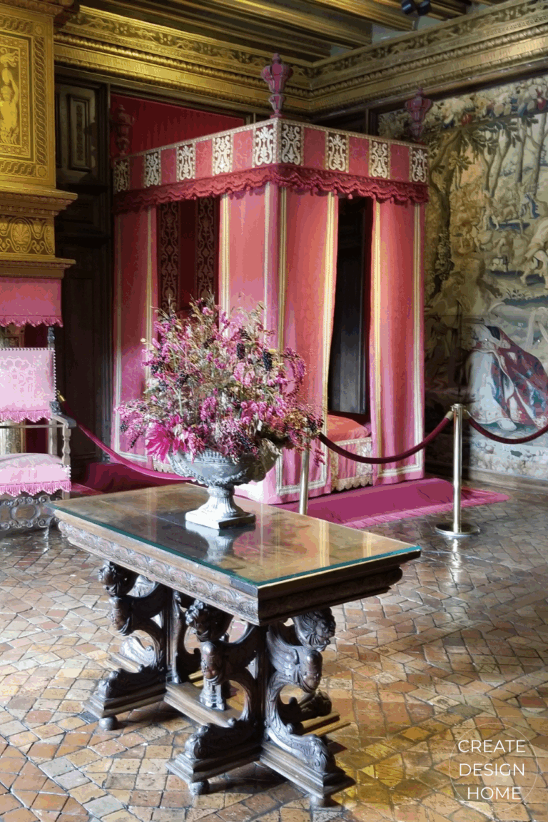
Red Fit for a King
At Château de Chenonceau, a red bedchamber was prepared for King Louis XIV, known as the Sun King, when he visited in 1650. By this time, Chenonceau had fallen out of fashion, making him the last king of the Ancien Régime to stay at the château. The room’s saturated red walls, gilded details, and layered textiles reflect how colour was used to honour rank and presence, transforming a bedroom into a ceremonial space.
Red – an Empire Style Favorite
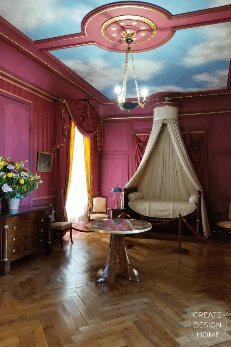
Red was a hallmark of the Empire style in the early nineteenth century, used in richly layered textiles and ceremonial spaces, including the apartments of Empress Joséphine at Château de Malmaison, where colour and classical form worked together to convey authority and elegance.
Similarly, at Château de Villandry, the red bedchamber of Prince Jérôme Bonaparte — Napoleon’s younger brother — was furnished in the Empire style in the early nineteenth century. Here, red in the interior design appears alongside classical forms, symmetrical proportions, and gilded ornamentation, reinforcing red’s long association with imperial authority and neoclassical grandeur.
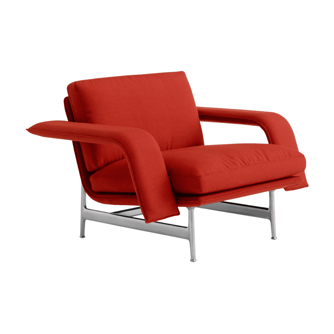
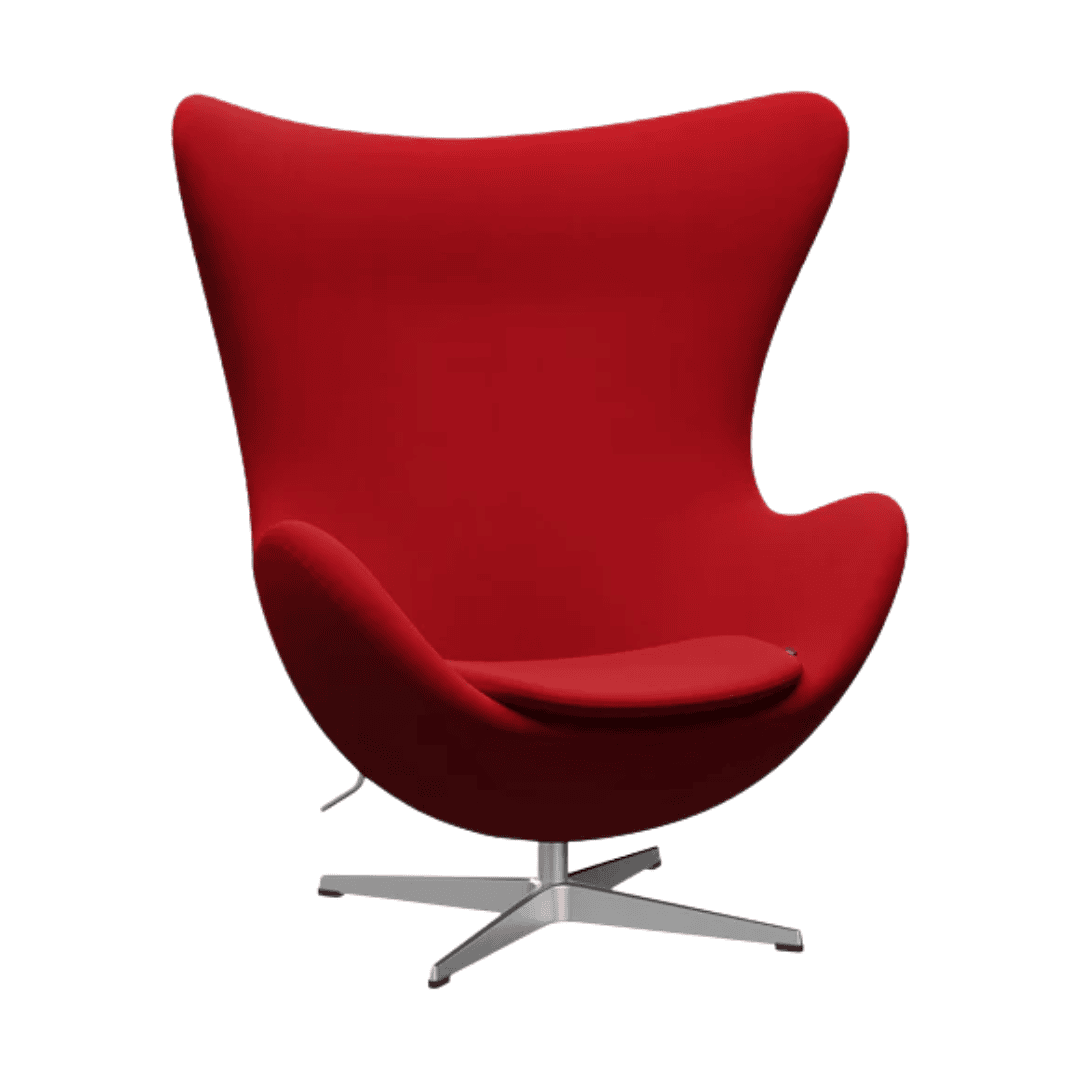
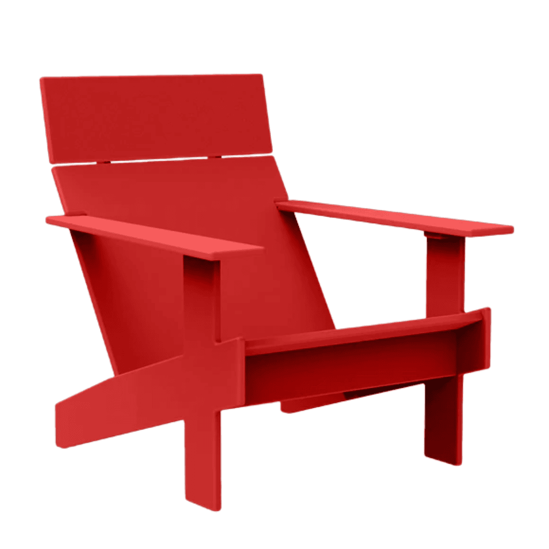
Red in Interior Design
These historic interiors reveal a consistent truth: red was never casual. It was intentional, symbolic, and deeply expressive. Used in textiles, wall coverings, and architectural details, red created rooms that felt enveloping, dignified, and emotionally charged — qualities that continue to inspire how designers use the colour today.